
It looks like this:


There are several aspects about this graph that set it apart from others shown in The Spirit Level.
For one thing, it uses a very different measure of inequality. In The Spirit Level, Wilkinson and Pickett use the gap between the highest and lowest 20% of earners. The graph above uses the ratio of rich to middle (90th:50th percentile). This has a dramatic effect on where the countries appear on the inequality spectrum. For example, it makes France suddenly much more unequal than the UK and Italy.
Secondly, we can only identify 10 countries. We don't know whether the unidentified countries are rich or poor, nor do we know if all the countries studied in The Spirit Level are shown here. Where, for example, is Japan?
In short, the graph Wilkinson and Pickett use is not comparable to their other graphs. Rather than relying on a solitary article, the best practice would be to seek out the actual figures and plot a graph along the same lines as the others in The Spirit Level. If we do that, a very different picture emerges:

The data for this come from the OECD and relates to 2004. Only OECD countries are shown, hence no Israel, Slovenia, Singapore or Hong Kong. There is no significant correlation between long working hours and inequality. Korea and Greece work the longest hours despite being neither particularly equal nor particularly unequal.
Some of the Northern European countries (the Netherlands, Germany, Belgium, France) work fewer hours but one only needs to compare the least equal nations (Portugal, the USA) to the most equal nations (Japan, the Czech republic, Finland) to see that there is little difference and that, therefore, it is highly unlikely that working hours are dictated by inequality.
A much stronger association can be seen if one compares working hours against national income. There is a suggestion in the graph below of working hours declining as countries grow wealthier.

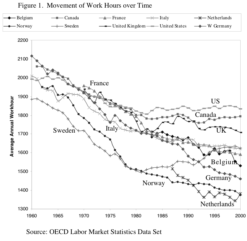
This correlation between wealth and shorter working hours is supported by historical data. The graph below comes from the article cited by Wilkinson and Pickett (above). The trend towards shorter working hours in the past 50 years (indeed, the past 100 or 200 years) is undeniable. The decline has levelled off in several countries since around 1990. It would be interesting to see figures from 2000-10.
The balance of evidence suggests that shorter working hours are associated with national income, not income equality.
2 comments:
There is something very wrong for your working hours for Japan. Japanese from my anecdotal experience tend to work very long hours. A lot longer than the USA. So I think the OECD data is garbage. It heavily conflicts with everything I have heard from people living in Japan.
The OECD figures show Japan to be at the upper end of the scale but not right at the top. Like you, I gather the Japanese work very long hours but I can only work with the figures that are available. In any case, Japan is the most equal country in the Spirit Level, so their long working hours do not fit their hypothesis. Presumably that's why they used a source that excludes Japan.
Post a Comment